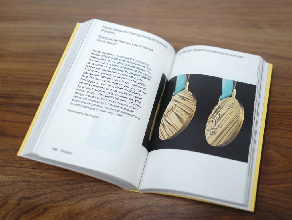
For the 2018 Designs of the Year Exhibition at the Design Museum, I nominated the medals designed by SWNA for the 2018 PyeongChang Winter Olympics.
Then I was asked to put all my thoughts into 140 words.


The design of the Olympics is the Olympics of design: difficult client, complicated brief and the added pressure of a critical global audience. This is a reinvention of that crucial element, the medals, for the 2018 Winter Olympics by designers SWNA. Rather than smother the surface with crests, torches and wreaths, components of Hangul text (the Korean ‘alphabet’) are extruded across each face. This elevates the medal from a disc with two flat images to a truly 3 dimensional object; the cris-crossing lines becoming tracks carved by skates, toboggans, skis or snowboards. Why is this a design of the year? Like much of the best design it draws on the object’s heritage without being overwhelmed by it. It demonstrates the power of a simple idea and that everything is worth looking at in a new way.
137 Words
