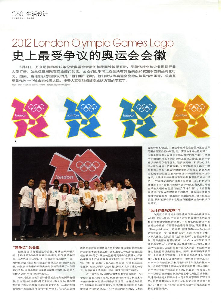
A feature story about the venerable history of Olympic branding and the awful London 2012 effort. Published in Modern Weekly August, 2007.


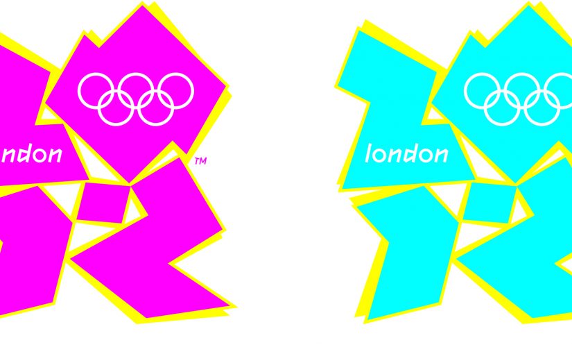
The branding and corporate identity industry was dealt a serious blow recently, when on June 4th, following great anticipation, the emblem for the 2012 London Olympics was unveiled. It seems that the public will put up with any amount of ill-judged, poorly implemented branding exercises when restricted to the commercial sector. When they perceive that it is ‘their’ money being spent, however, and that the work is supposed to represent them as a nation, or even as a city, everyone suddenly becomes an expert. If you haven’t seen the logo yet – feast your eyes! It is as different as it is possible to get from the Beijing 2008 emblem, whose designers managed to incorporate a feeling of movement, celebration, happiness, whatever, whilst also keeping something about the host city and its heritage intact. The series of angular shapes from the London emblem might suggest a degree of dynamism, but multiple interpretations spring out at the viewer before it becomes apparent that they are supposed to be read as the numerals 2012.
There have been many instances of a public reaction to conspicuous design work of this type, but never quite on this scale. There is a sense that, after working so hard to have London appointed host for the 2012 games, we have been unable to get anything right since. The spectacle of such a high-profile and colossal failure to match up to public expectations has been a gift for British newspapers looking to criticize the management of the Olympic preparations, estimated to be currently running over budget by as much as four times (now over £9bn). The branding commission alone is rumoured to have taken a year, at a cost of £400,000. Somewhat less than value for money, it has been suggested. In fact, so strong has the public reaction been, that in just two days over fifty thousand people had ‘their’ say on the matter by signing an online petition to have the logo scrapped.
The official word on the logo from the 2012 organising committee is that “The new emblem is dynamic, modern and flexible. It will work with new technology and across traditional and new media networks. It will become London 2012’s visual icon, instantly recognisable amongst all age groups, all around the world. It will establish the character and identity of the London 2012 Games and what the Games will symbolise nationally and internationally.” The un-tested part of this statement, and indeed, the part on which both the committee and the designers are relying for their defence, is how the logo will work across different media. It is true that any logo needs to work well not only in print, but also on the web and on emergent media such as mobile phones; all of which have different requirements. The examples shown during and since the launch, however, do nothing to justify why the logo looks the way it does. Having it fizz and crackle over some footage of various sports is just not sufficient. OK – it looks slightly better when it moves. But is that good enough? It seems that even this feature, which has ‘saved’ the design in some people’s eyes is at risk. Early reports of viewers having epileptic seizures provoked by the flashing, are unconfirmed — but sure enough, that version of the identity has been withdrawn with the approval of the British Epilepsy Association.
The design company responsible, international branding giant Wolff Olins, have wisely kept silent for the most part during their public mauling. Some prominent figures in the design establishment have rallied a little to support the design, although not unreservedly. Deyan Sudjic, director of the Design Museum, admitted that it wasn’t a ‘classic’ design but that “it’s not bland and it’s not corporate either. It is saying we are groovy, it is quite sharp, and it is saying this is for the world of skateboarders and MySpace users.” I’m not so sure. First of all, I’ve been to MySpace. It might be a little hectic, but it’s also easy to follow and does what you expect it to. Also, I’m not sure I want the director of an institution like the Design Museum telling me something is ‘groovy.’ Shouldn’t we be aiming for something that IS a classic design? Surely anything less is a failure for a city that has traded for so long on its designer credentials. Some have pointed towards the very fact that it has caused such an outrage as an achievement. In a city which prides itself on being a global centre for so many creative industries, it is right to produce something provocative that perhaps not everyone will like. This is not an adequate defence though, for something which interprets desirable characteristics such as “vibrant,” “bright” and “energetic” in such a self-conscious manner.
I spoke to trend analyst and youth brand specialist Sean Pillot de Chenecey for his thoughts on this latest attempt at branding the capital. “This is just the latest – albeit a spectacular – example of the design community scoring an enormous own-goal. Over the last few years we’ve seen respect for ‘design-world’ growing rapidly amongst senior marketers, as the sheen has completely evaporated from the once-glossy world of advertising. Design — that most compelling and empathetic of areas where one literally holds the ‘brand essence’ in ones hands, had at long last come to fruition in a marcoms world where uncertainty and change was the only constant – hence the desperate need for solidity and authenticity delivered by leading design consultancies. And then — this ludicrous nonsense takes us back to square one, where the only ones laughing are yesterdays admen in Madison Avenue and the tired streets of Clerkenwell. What a waste. Still, at least it gives us an excellent new challenge. Can anyone – literally anyone – design a more pathetic, meaningless logo than the one created in this instance? Answers on a postcard please.”
In the wake of this controversy, a number of initiatives have sprung up, including one by the BBC, for members of the public to do just that. People are now submitting not only their comments, but also their own designs for the event. For me, this exercise, whilst highly entertaining, is counterproductive. More than anything it serves to emphasise what little understanding people have of branding, and what such a logo should be attempting in the context of the Olympic Games. Much of the criticism is along the lines of “a four-year old could have done better than that,” or “it should have some images of London or it’s famous landmarks,” and “there is no reference to the sports.” This is missing the point entirely – it doesn’t matter how old the designer is, or how long it took them to do it. It is also nearly 60 years since London last hosted the Olympics (in 1948), when the Houses of Parliament featured prominently in the emblem design. We have moved on since then; if the words ‘London’ appear we hardly need an illustration to remind us what it looks like. Similarly, we can see the Olympic rings – we know it’s about sport! The challenge is to create an image that both complements those two elements, while at the same time saying something about contemporary London life. In addition, it is reported that the designers were instructed to make a break from the corporate image of the Olympics, making it more “street” than “boardroom,” thereby making them more relevant to a younger audience. This is undoubtedly a tough job for a designer.
If you had the pick of any design company, though, you would expect Wolff Olins to be up to the job. Not only have they created some of the most visible, striking and memorable brands over the last 30 years, they also wrote the book on the subject! Or at least one of their founding partners, Wally Olins, did. In it, he describes some of the conflicts that a designer has to resolve in a successful identity campaign: “Most organisations naturally look for a symbol to inspire feelings of confidence, comfort and empathy. They like to play safe, but of course, they want to be distinctive. They want to be modern, but of course, they want to be timeless. They want to be strong and memorable, but of course they don’t want to be offensive.” Popular opinion would seem to have found Wolff Olins wanting in several of these areas with their latest creation. Ironically, the company was also involved with the identity for the last Olympic Games, held in Athens in 2004. The emblem that year, “Kotinos,” was familiar, safe territory for the consultancy, consisting of a stylized olive wreath on a blue background.
While the jagged forms of the newly unveiled logo would appear to owe something to contemporary art forms such as graffiti, it still seems rather unambitious – and a long way from the Olympic ideal of helping to build a “peaceful and better world by educating youth through sport.” Indeed, since the very beginning the Olympic movement has been synonymous with trying to match the best in sporting achievement with the best in the visual arts. Those of us who are not particularly interested in sport will still tune in to see the pageantry of the formal ceremonies, processions, fireworks; the success of which, is all down to careful management of the visual communication elements from the architecture of the stadium to the torch to the medals to the uniforms, posters etc. A branding company is the natural place to start looking for the expertise to undertake all of this. After all, it is simply about developing a consistent look and identity, albeit on a very grand scale. Despite this, even the word ‘brand’ seems a little vulgar for the idealism that is at the core of the Olympics. The most famous signifier of the movement are, of course, the five interlocked rings. These were created by the founder of the modern Olympics, Baron Pierre de Coubertin, in 1914 (first implemented in 1920) to symbolise the fraternity of the nations of the five continents. Whilst they are incorporated in every element of Olympic communication, their use is governed by extremely strict rules. It doesn’t seem very “street,” does it?
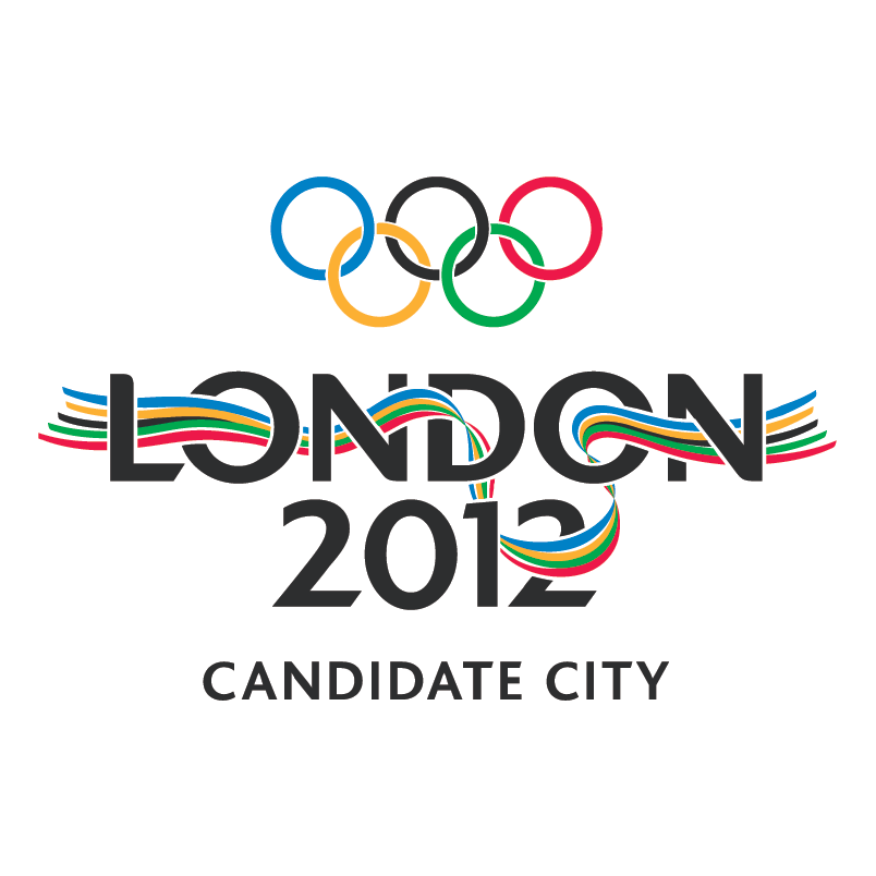
To understand how far things have come, we need to look at some of the landmark graphic design work created for the Olympics. Following the introduction of the ring emblem, the next serious milestone was the work created for the 1968 event, held in Mexico City. The design team, led by New Yorker Lance Wyman knew they had to devise something striking, as the organisers didn’t have the resources to invest in the costly grand architectural statements that had so often been a feature of previous games. They certainly managed in this respect. Not only did they manage to convince the Olympic Committee to allow them to tamper with the sacred Ring emblem, but they also eschewed all figurative or representational graphics in favour of a psychedelic pattern which they proceeded to slap onto everything from posters to the stadium grounds, to the officials’ uniforms. Next to the current London proposal, there is no doubt which is more ‘groovy.’
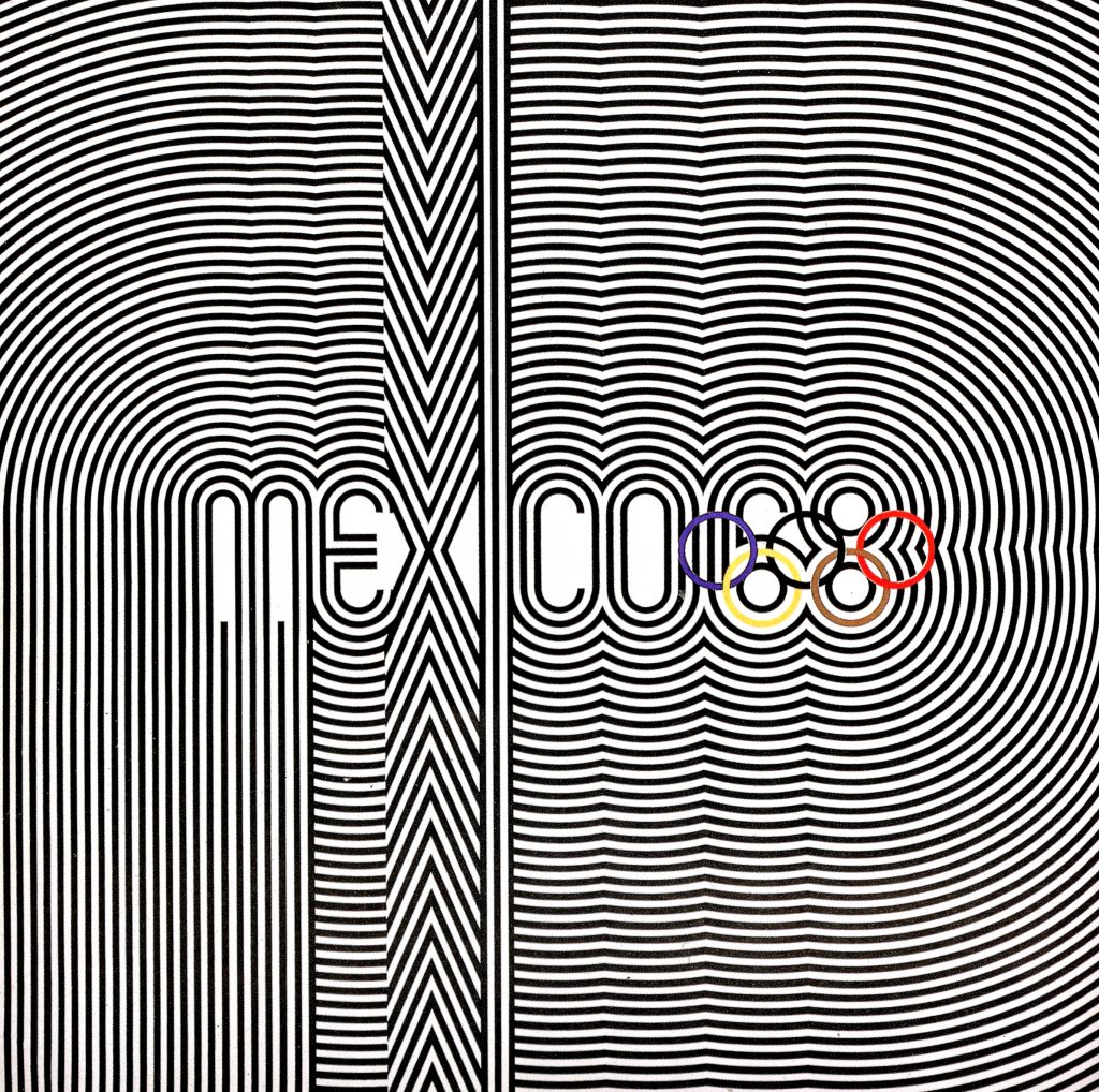
Four years later saw the 1972 Munich identity implemented, designed by a team led by Otl Aicher. This is often cited as an example of modern design at its best, and was celebrated recently at an exhibition in London – 35 years after it first appeared. The exhibition was organised, curated and designed by London consultancy Bibliothèque, who aspire to, and in many ways, continue, the design values and approaches exemplified by Aicher and his team. I met with Bibliothèque partner Mason Wells to discuss the work, and his vast collection of Munich Olympic graphic design.
BH: Why is this work so important to graphic designers?
MW: For me the legacy of Olympic graphics tends to focus around things like the ribbons and painterly elements. Aicher’s stuff is so important because it cuts through all that; because of it’s well-defined, rational approach; I believe it was the first identity that incorporated serious design principles all the way through the work.”
BH: How did Aicher get the job in the first place?
MW: He got the job for the Olympics partly through his credentials as the head of the Visual Communication department at Ulm, and partly because he had recently created the Lufthansa logo, which was recognised as being leagues ahead of the competition at the time.”
BH: The Design School at Ulm was, and still is, a great influence on European design. As I understand it, the school was closed by the end of the 60’s. How did working at the school influence Aicher’s work?
MW: “For me, the 1972 Olympics graphic model was the culmination the 15 years or so of thinking of the Ulm Visual Communication department. Aicher was a founding member of the department, as well as Head of the school for a time in the 1960’s. The work for companies such as Lufthansa and Braun were created by him and his team of students at the school, and serve as exemplars of their formal, rational and technology-driven approach. The school closed in 1968, but Aicher had been appointed the year before to head up the team for the ’72 visual identity.
BH: So what is special about the design?
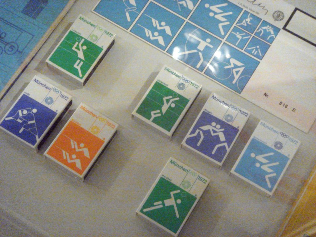
MW: “Each Olympic identity has a number of elements which work alongside the rings — they [the rings] are all about optimism, brightness and inclusiveness rather than sporting endeavour. It is the same with Aicher’s model. The main emblem is the “Wreath of Rays”– a sort of abstracted sun device which echoes the official motto – “The Happy Games,” and then it was only in the pictograms for each event that you saw the athletes, or reference to the sport. There had been pictograms at previous games, but never with this level of rationalism; each one is constructed from the same set of shapes, uniform in line weight, angle, everything. The colour scheme is also key – Aicher deliberately chose bright, lively colours whilst avoiding any use of red or black (except for text) in the scheme. This was to distance the image of the games from those held in Berlin 36 years earlier, which became known as the “Nazi Games” for the prominence of German nationalist iconography at the event. The identity guidelines are so clear, they cover every single detail of the event from the ticketing to the posters to the event rules for the officials. There is nothing left out. They look as if they were done yesterday. I would go so far as to day that Aicher was the pioneer of corporate identity as we understand it today.”
BH: “It seems that many countries strive to create an image with strong cultural reference points. Was Aicher trying to eliminate this entirely?”
MW: “Aicher approached it with no nationalistic idiosyncrasy. He tried as far as possible to remove any reference to a particular country, and to make the scheme as rational, legible and universal as possible. When you consider this in more depth, you could say that this attitude itself is representative of a German way of thinking, but it is an approach that many graphic designers, including myself, are keen to implement.”
BH: Given that you have such a passion for this area, you must have been anxious to see what would be chosen as the emblem for the 2012 games.
MW: “I was really disappointed to be honest. In fact I was as disappointed in the logo as I was in the lack of opportunity it gave for some of the emerging creative talent in the UK to get involved. It went to Wolff Olins in the same way that big, high profile Architectural commissions tend to go to [Richard] Rogers or [Norman] Foster. You know that they have the ability to execute and implement the work across all media. A smaller firm just can’t handle a job of this scale, which is a shame really. As for the logo itself, I guess it ticks a few of the current trend boxes, but it has no longevity, by 2010 it’s going to look incredibly outdated. Having been involved in putting on the Aicher exhibition, I was looking forward to seeing something really good, and it left me totally deflated, to be honest.”
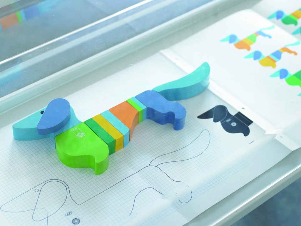
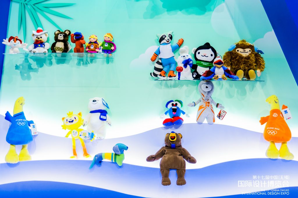
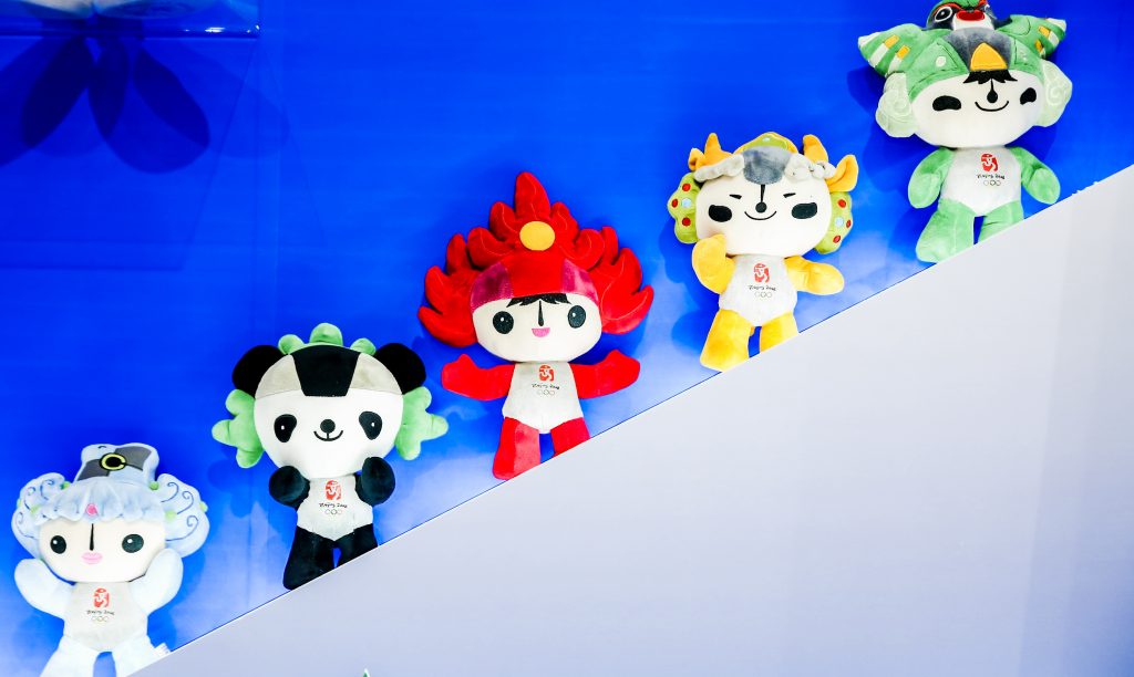
A further legacy of the 1972 Olympics was the first ever official mascot; “Waldi.” Waldi was a sausage dog, or dachshund, a breed popular in Bavaria. Along with Aicher’s other graphic elements, he was a rational dog. A sort of proto-Corbusian-golden-section of a sausage dog. Whilst not too many people remember Waldi, he left his mark – the mascot remains one of the five elements that designers have to consider when creating the visual identity of any Games. The other four are: the emblem; the poster; the torch and the medals. I for one, can’t wait for the unveiling of the mascots for the 2012 Olympics. Ah, yes – the mascots. Who could forget Haakon and Kristin from the 1994 Lillehammer winter games, or Amik the Beaver from Montreal 1976?…. Well, just about everyone, it seems; but they are an inevitable part of the Olympic landscape, and an inevitable magnet for media criticism. Even the five cute panda babies(?) that make up Beijing’s FuWa mascots have not been exempt from this. As with the other graphic elements, Olympic mascots have had their highs and lows over the years. Waldi was the first, and managed to walk the line between cuteness and ambassadorship with some confidence. The same cannot be said of “Izzy” the mascot for the 1996 Atlanta games, who marked something of a low point. His (her?) designers appear to have been unable to decide on a theme for their character, and gone for a truly strange fish-out-of-water fantasy. One almost feels sorry for it, looking as it does like a cross between a shark in trainers and nothing much at all. They even gave up on its name – “Izzy” is short for “What Is It?”

As the months go by, it is possible that the London public will grow to love their new emblem (as the organisers hope). Or it might be that the designers make amendments in light of the public reaction. This is unlikely, though. No one wants to admit they were wrong. Maybe the much-touted media implementation will save the day. I certainly hope that officials don’t decide to revert to the “Candidate City” logo, which had been used since November 2003, which is extremely bland by comparison. One thing is for sure, though, Londoners will be watching the progress very closely for signs of the mascot that will represent them in 2012.
http://www.wolffolins.com
http://www.olympic.org
http://www.bibliothequedesign.com/72/
images and captions:
400m.jpg – Poster of 400metres event from Munich 1972
Athens_2004.eps – “Kotinos” Emblem of the 2004 Athens Olympics.
Beijing_2008.eps – Emblem of the Beijing Olympics in 2008
Braun.eps – Braun Logo, designed by Otl Aicher in 1954
Cobi1.eps – Mascot of the 1992 Barcelona Olympics, designed by Javier Mariscal
Cyclist Pictogram.jpg – Cyclist Pictogram from Munich Olympics 1972, designed by Otl Aicher
fencing regs.jpg – Fencing event regulations from Munich 1972, designed by Otl Aicher
Izzy1.jpg – “Izzy” (Mascot of the Atlanta 1996 Games)
London Candidate 2012.eps – Emblem of the Candidacy for London 2012 Games.
London2012.eps – Emblem of the London 2012 Games, designed by Wolff Olins.
Lufthansa.eps – Lufthansa logo, designed by Otl Aicher in 1964
Match boxes – Munich 1972 pictograms on matchboxes
Mexico68.jpg – Poster of the 1968 Olympics, designed by Lance Wyman.
Waldi.jpg – “Waldi” (Mascot of the 1972 Munich Games)
wreath of rays.jpg – “Wreath of Rays” emblem of the 1972 Munich Games, designed by Otl Aicher
Some additional images:
(these have been collected since writing the article, but relate in some way)