“If you like my Clay chairs, you must be a Good Guy” Maarten Baas.
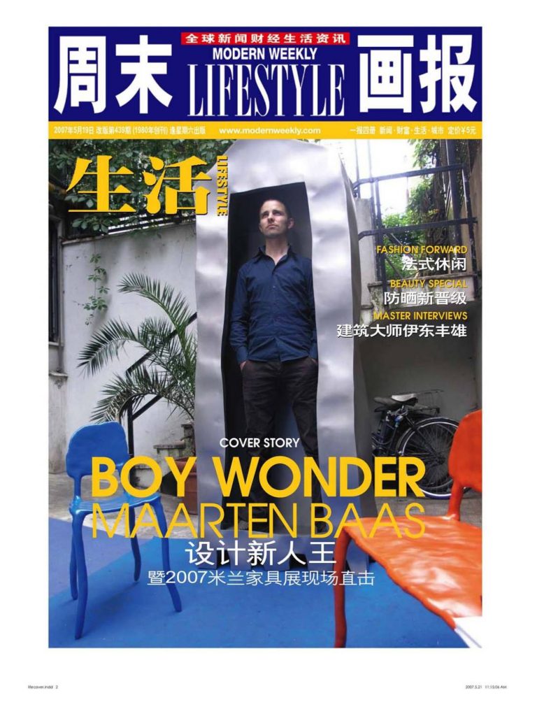
This was the first full scale review I did of the Milan Furniture Fair. I continued to write regular reviews for Chinese publications for around 10 years. It was always a rush to get to interviews during these years as I was also putting on exhibitions with my students, but all this adds to the excitement of the fair! The best bit was meeting designers whom I admired. It was great to get Maarten Baas on the front cover of the magazine (even using my amateur portrait!) as the covers of MW are typically reserved for Hollywood celebs.
It has been described as the ‘Edinburgh Festival of Design,’ and for one week in April, it is the only place to be seen if one is serious about the subject; serious about buying it; selling it; talking about it; or simply looking at it. Whatever one might think about the Italian design scene, during the Fair, this normally grey and rather severe city softens a little, as it is transformed into the undisputed global headquarters of design. In common with the Edinburgh festival, the Milan Fair is really two events in one: the official activity, corporate focus and serious money is located at the Fairgrounds in Rho; designed by Massimiliano Fuksas and opened in 2005, this is a vast complex of over 2,500 stands, where design junkies can explore the best (and worst) of mass-manufactured furniture from around the world. The other, less official, events take place in central Milan, and involve around 400 venues – a mixture of galleries, showrooms, shops, studios and schools all competing for attention from visitors who flock to the city in their hundreds of thousands, all looking for inspiration and fresh ideas from the limitless range of things being shown.
Many individuals and companies use this event as the springboard from which to launch new products and collections. It is where they can reach the biggest audience in one go, but is also where they know they will be judged quite ruthlessly alongside each other. In an environment which is often accused of taking itself too seriously, it is often the most subversive, unexpected work that stands out. One designer who made just such an impression this year was Maarten Baas.
Baas came to the attention of the design community in 2003, when his ‘Smoke’ range was published by fellow Dutch designer Marcel Wanders’ company, Moooi, to great acclaim. Four years later, and still only 29, Baas returns to Milan with the work from his own studio and a collection of highly inventive, playful works that demonstrate his maturing into a versatile, sophisticated and surprising designer. I managed to corner the designer to discuss his achievements and aspirations:
This exhibition is part-retrospective and part new works. How do they all relate?
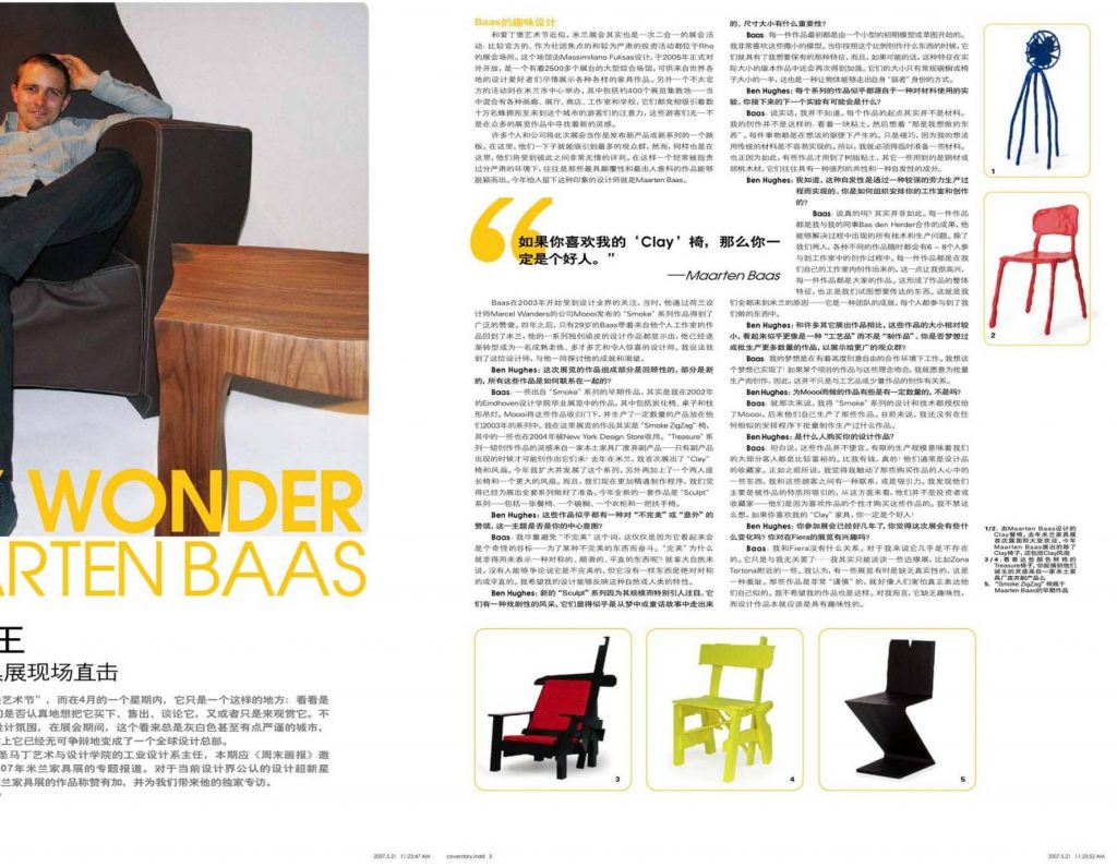
The earliest pieces, from the Smoke collection are actually from my graduation show at Eindhoven Academy in 2002, consisting of charred chairs, tables and chandeliers. These were taken up in part by Moooi, who produced them in some quantity for their collection in 2003. The piece I am actually showing here is the Smoke ZigZag chair, [a burned copy of the Gerrit Rietveld icon]. Some of these were also take up by [New York Design Store] Moss in 2004. The ‘Treasure’ collection is a furniture series inspired, and constructed from, the waste by-products of a local furniture factory – a collection that can only be in production for as long as the objects from which the by-products come! Last year in Milan, I presented the first of the ‘Clay’ chairs and Fans. I have expanded and developed the range this year, with the addition of a two-seater bench and a larger fan. We’ve also become more proficient at the process and feel ready to present the full collection. The completely new pieces this year are the ‘Sculpt’ collection – a dining chair, cupboard, cabinet and armchair.
These pieces seem to share a celebration of ‘imperfection’ or ‘accident,’ is this theme your central intention?
I try to avoid the word ‘imperfection,’ simply because it would seem a strange aim – to strive to achieve something that is imperfect. Why should ‘perfect’ have to imply something that’s symmetrical, smooth and straight? Think of nature, for example; nobody could argue that it’s not perfect, but there is nothing symmetrical or straight about it. I hope that my designs reflect this natural, or human characteristic.
The new ‘Sculpt’ range is particularly striking because of its scale. They have a theatrical presence suggesting they’ve come out of a dream, or fairytale. What is the significance of the size?
Each of the pieces started off as a small maquette, or sketch-model. I like these tiny models very much. When you make something on this scale, they have such character, which I wanted to preserve and, if possible, emphasise in the full-size version. The fact that they are half as big again as a regular cupboard or chair is a way of enabling the object to out-grow its ‘underdog’ status.
Each collection seems to stem from an experimental approach to materials. What might you experiment with next?
Honestly I don’t know. The starting point for each project really isn’t the material. I don’t look at a lump of clay and think “That’s something I would like to work with.” Everything is driven by the ideas. It just so happens that the ideas I have are not easy to realise with traditional materials. Therefore, I have to improvise. Hence the use of the resin clay for some pieces and the steel and walnut veneer for others. The thing they tend to have in common is a strong character, and an element of spontaneity.
This spontaneity is achieved through quite a labour-intensive production process, I understand. How is your studio and production organised?
Honestly? It’s not. Each piece is the result of a collaboration between myself as designer and my colleague Bas den Herder, who is able to work out all of the technical and production problems. As well as us two, there are between 6–8 people involved in the studio at any time on various projects. I very much like the fact that each piece is made in our own studio, and it is the product of everyone. It contributes to the overall character, which we are trying to communicate. That’s why we are all here in Milan – it’s a team effort and everyone is involved in what we are doing.
The scale of production is relatively small when compared to many others who are exhibiting, which suggests a ‘craft’ rather than a ‘production’ approach. Is your dream to be producing in larger numbers, to a wider audience?
Actually my dream is to work in a collaborative environment with large degree of creative freedom. So I guess that dream is already realised! I would do work for mass-production, if the project fitted with the ideas, so this is not exclusively about craft, small volume work.
But the pieces for Moooi were made in some numbers, weren’t they?
In that case, I licensed the designs and know-how for the Smoke range to Moooi, who then produced the work themselves. I don’t currently have any work produced under any similar arrangement.
Who buys your designs?
To be honest, these pieces are not cheap. The scale of production dictates that most of our clients are fairly rich. Richer than I am, in fact! They tend to be collectors of design. Having said that, I like to feel that I touch something in the people who buy work; that I have some connection, or affinity with customers. I find that they are attracted mainly by the character of the objects, and in that way they are not investor-collectors – they buy the work because they like its personality. I can’t help thinking that if you like my ‘Clay’ furniture you must be a nice guy!
You have been exhibiting at the fair for a few years. Do you feel it has changed at all? Do you have any interest in exhibiting at the Fiera?
I don’t have any connection with the Fiera. It’s almost non-existent to me. It’s just not my business… I can really only talk about the fringe events, such as the ones around here in the Zona Tortona. I think it is a shame the shows are sometimes lacking in authenticity. The work is very ‘careful,’ as though people are afraid of really expressing themselves. I don’t want my work to do that. For me it is lacking in the fun, that should come with design work.
Elsewhere in the Fair, all the big names were vying for attention with a bewildering mixture of gimmick, freebies, product launches, drinks receptions and self-importance. At certain venues, the shows had much more in common with showbusiness glamour and hype than the furniture trade-show that this is meant to be.
The hysteria was in full-effect in Via Palermo as a huge crowd attempted to squeeze past the tight security to get into the party put on by British furniture company Established and Sons. Once the venue was at full one-out, one-in capacity the pavement was quickly awash with irate VIPs and celebrities trying to get in. Inside, the crowd was busying themselves with the important tasks of being seen and lapping up the hospitality. It is a strange, and slightly disappointing phenomenon to have to fight to gain entry to a show where the main attraction just sits there and does nothing. Doing nothing this year we found existing works from the previous two years’ shows along with a number of new designs. Jasper Morrison, who generated such controversy last year with his £100 wine crate seemed to be taunting his critics by coming up with a whole “Crate” range. This utilitarian design at non-utilitarian prices continues to pose the questions: If you are the sort of person who wants ‘found’ furniture in your home, are you also the sort of person who wants to pay through the nose for it? If it’s been manufactured by a trendy furniture company, it’s not really “found” any more. Is it? Another key figure for the British firm who added more to their collection was Zaha Hadid. The superstar architect has come up with “Nekton,” a group of squat, shiny, undulating shapes that can be pushed together to form a bigger squat, shiny, undulating form, either for sitting-on or looking-at. These are made from a marble-dust and resin compound called Fordacal that mimics stone, but minus the flaws, or imperfections of the natural material. This is probably as close to a “practical” piece of furniture that we will see from Hadid, which must be a relief for the company — at least would fit into most people’s homes, even if they couldn’t afford them. The same cannot be said of her 3 metre long 80kg one-piece polyurethane “Aqua” table, launched last year, which doesn’t even have a flat surface on the top. If you’ve been searching for an interior statement that says “What I’m all about is Fred Flintstone meets Barbarella,” then look no further than Nekton. Amongst the other products launched by Established and Sons was a fun clock conceived by Sebastian Wrong as an object-lesson in typography. “Font Clock,” which marks time through an endlessly fluctuating mixture of type style is a novel update of this style of vintage drop-leaf clock. Sam Hecht of Industrial Facility provides another spin on a familiar classic in his “Beam” lamps. This collection of table, standard and pendant lamps have an extended shade as their theme, turning part of the projected light into a solid entity. Whilst this idea has been explored by other designers in the past, this incarnation gives the idea a clear and crisp identity, familiar to those who have seen Hecht’s work for Japanese company Muji. These two practical, fun and well-detailed products suggest that Established and Sons is finally getting some of the designs that it deserves, that live up to the hype surrounding the brand.
The other big party of the week was at the “Crystal Palace” – Swarovski’s giant installation in Via Tortona. Again, this was a great excuse to dress-up and show-off in surroundings laboriously concocted from thousands upon thousands of multi-coloured spangly crystals. It has become a tradition for the company to reinforce their design-led credentials, and showcase their brand through commissioning a range of designers to create one-offs with as much “Wow” factor as they can muster. One can’t be sure exactly how the company brief the designers, but it must be something along the lines of “make the biggest, shiniest thing possible.” Leading the “big,” and “shiny” stakes this year was a giant, 12 metre long, 3 metre high, organic walk-through structure in metallic, multi-layered fibreglass containing six projection units and over 5,000 metres of crystal strands. This monster, created by Belgian designer Arne Quinze was certainly a challenge to traditional ideas of what a lamp might be, but the overwhelming effect is of the scale and cost of the production, not the aesthetic achievement. Quinze was joined by 18 other designers whose interpretation of the crystal theme varied in scale, complexity, and success. One of the more complicated installations was the four-metre diameter, 30,000 crystal monster “Morpheus” by Yves Béhar that writhed and twisted at the command of a control panel on the ground. This overshadowed much of the other work from the likes of architect Kengo Kuma, Amanda Levete of architects Future Systems, milliner-to-the-stars Philip Treacy and the inexplicably ubiquitous Jaime Hayon, although like the giant crystal grotto, it felt far too laboured to really excite from a design perspective. The real star of the show was a simpler, more refined development of the chandelier archetype by the London-based duo Fredrikson Stallard. Their piece, “Pandora,” was made up of a matrix of suspended crystal spheres hung to mimic a chandelier silhouette. This shape gently distorted and disintegrated as each component was moved up or down by a hidden control mechanism. The overall effect was far more calm, subtle and poetic than its attention-grabbing neighbours, and really shows what is possible with a clear concept and strength to follow it through. The trend for this kind of ‘animated’ lighting was spearheaded by the work of Italian Design Master, Gaetano Pesce in 2006 with a shape-shifting piece called “Mediterraneo,” which not only moved, but also changed colour and emitted smells. One can’t help thinking that Fredrikson Stallard’s work eclipses not only the other animated pieces at this years show, but even surpasses Pesce’s over-complex creation. I managed to catch up with Ian Stallard and Patrik Fredrikson to find out how the work had evolved, and whether it turned out as they expected: “In designing Pandora we wanted to show off the crystal to its best effect through movement and choice of lighting. The result surpassed our expectations; the intensity of colour was amazing. The alignment of the crystals at the starting point of the chandelier’s movement cycle, when it forms an iconic chandelier form, will be made even more perfect when the piece is displayed in future, but details like this are always to be expected in any prototype. Overall, we were thrilled.” The simplicity of the form suggests to me that the mechanism controlling it is far from simple. How did they work out the mechanics of it? “In the first instance we worked out the mechanics by recreating a scale model section of the chandelier an constructing a mechanism with fishing wire and cotton reels. Following this and a couple of computer animations, the final mechanism was worked out in collaboration with Moritz Waldermeyer, electronics engineer and genius. There are 4 motors each with different motions. Each of these has 10 cogs of different sizes to make different speeds. This means there are a total of 40 different movements randomly applied to the 583 strings and 1,990 crystals.” In terms of core activities, this piece is something of a departure for a team normally associated with furniture and ceramics. Is this going to lead you to different areas in the future? “Ian studied ceramics and Patrik Product Design, Graphic Design and Architecture. We don’t feel limited to certain disciplines in the direction our work will take us. If we need to suggest a classification for what we do, we would say we are Designers or Furniture Designers. Recently we have been working mainly with furniture, particularly on our new collection for David Gill Galleries in London, but have some varied and exciting potential projects coming up in the near future.”
Nearby, also in the Tortona area of town, British design brand Tom Dixon was showing the latest additions to his range, described in terms of a re-discovery or return to metals – the material in which he first experimented as a designer. New works include the “Beat” brass, and “Diamond” aluminium pendant lamp. The former recalls the mix of intense, warm colours seen in the successful “Copper Shade,” (confusingly made out of plastic) seen in previous years, but with a more craft-orientated hand-finished aesthetic. Other new objects include the cast-iron candelabra “Spin” and aluminium pendant “Pipe.” The stand was finished off with a silver-plated version of Dixon’s “Slab” table – the glossy, metallic surface in direct conflict with the exposed and enhanced oak grain.
Since making the transition from consultant and maker to international brand, Tom Dixon has typified the aspirations of many young designers. All over town, new, young, independent designers were showing their work with the aim of finding fame and patronage amongst the larger firms and buyers. This impact was strongest where there was a concentration of talent for the visitor. The Salone Satellite, an addition to the main Fair in Rho, has long been a focus for this type of work, but in the city itself it is organisations like Designersblock who put on the best shows. Here, one can see a variety of experimental and inspirational work from designers who are likely to be the stars of the future. Organisers Piers Roberts and Rory Dodd gathered a characteristically diverse group of exhibitors this year including a company called DIY Kyoto, who have a range of devices for monitoring electricity use in your home, and Crispin Jones, who was launching a range of watches with unexpected messages, to “inspire” or help make decisions. One simply oscillates between saying “yes” and “no” every second, while the “inspirational” messages offered by another switch between the positive, such as: “you are an amazing person” to the negative, such as: “everyone hates you.”
Droog Design and Marcel Wanders
Since first finding fame here in the mid-nineties, Droog Design from the Netherlands have become a staple of the Milan Fair, and this year was no exception. Outside of the design world, the idea of Droog is rather strange. Unlike other firms, its primary focus is neither about designing things for clients, nor about making objects to sell; it’s a collection of individuals and objects who get involved in a wide range of activities within design. The whole lot is overseen by the influential figures of Gijs Bakker and Renny Ramakers who manage to find, or attract, some of the most interesting practitioners around with whom to work. This year’s presentation was entitled “Smart Deco 2,” an updated version of an exhibition first shown in Miami last year. The themes are classic Droog; mixing high tech materials with character, interactivity and a concern for sustainability.
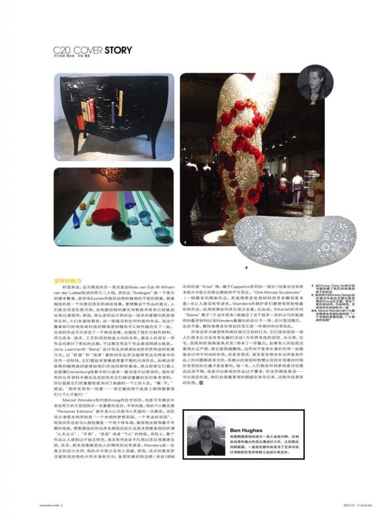
For me, the highlight of the show was a piece by Dutch duo Niels van Eijk & Miriam van der Lubbe called Godogan. This is a large hardwood dining table decorated with an Escher-style fractal pattern of animals and plants depicting an Indonesian fairy-tale. To understand the significance of this piece, one must first appreciate how the technique of computer-controlled laser-cutting has become so over-used and poorly-implemented by so many designers that one despairs of seeing any innovative work in the area. This table cleverly manages to merge high-tech precision with hand-finished beauty by having half of the two dimensional laser-cut design turned into a deep-relief carving by a group of artists in Indonesia. The resulting object tells not only the fairy-tale, but also a story about our relationship with materials, labour costs, technology, craft and mass-manufacture. Other objects in the show explored similar themes, but never so elegantly. Much was made of Joris Laarman’s “Bone” furniture, inspired by the way structures develop in the natural world. Objects which were described in terms of “lightness” and “efficiency” failed to deliver on either count, appearing more like massive, load-bearing lumps. These chairs and chaise-longue could be forgiven for looking like props in a Cronenburg movie if they really delivered what they said the did. I couldn’t find any reference to their actual weight in any of the publicity, so I asked one of the gallery staff how light they were. “Oh, no,” she said, “those things weigh a ton! – it took three of us to lift it on to the plinth!”
Sometime Droog collaborator, and significant member of a huge contingent from the Netherlands at the Fair this year was Marcel Wanders. His solo concept show “Personal Editions” was unfortunately felt by many to be a disappointment. Conceived by the designer as “a dream garden of lightness, a garden of wonders” the reality felt more like an undergound carpark, badly decorated with an uneven carpet and strewn with objects that failed to communicate anything of the designers intended “humanistic,” “accessible,” “intimate,” or “personal” qualities. In fact the whole thing felt uncharacteristically overblown and pretentious to connect with an audience who have come to expect much more. Few would dispute that Wanders is a true design Master who has the genuine ability to surprise and delight, but this show failed to deliver on both counts. The much-touted crochet chair (a spin on the genuinely innovative “Knot” chair from 1996, and part of the Cappellini range) turned out not to be as delicate or magical as the photos suggested, and the one collection that looked as though it might be able to inject some of the much needed wit and invention, the “One Minute Sculptures” (a group of gold-plated ceramic lumps whose appearance suggests more about the raw material than the intention of the sculptor) felt lost; one design joke too far in the company of the rest of the cavernous show. Fans of Wanders’ had to look elsewhere in the Fair to see his best work. The wonderful “Stone” stools for Kartell, for instance, (launched last year) merge the best that the technology-savvy company can offer in terms of materials with what Wanders is best at: a neat, clever and unexpected design. The overall effect is something both precious and jewel-like in an ultimately everyday object.
All this hype and frenzied attention-seeking succeeded in bringing some glamour to what one imagines to be a fairly dull activity – the serious buying and selling of furniture for hotels, offices, homes, hospitals and airports around the world. In case one starts to take it all too seriously, it is worth being reminded that this is to the furniture business what couture is to fashion. The question of whether or not you would want to buy, or even sit on, much of the work, is secondary to the wit and invention on display, and the fun you can have looking at it. Every year one hears visitors commenting that the quality is lacking, or that there it too much to see, but this is rubbish, and if one thing is for sure, they will all be back again next year looking for more, with even higher expectations.